The Pill Club UX Case Study
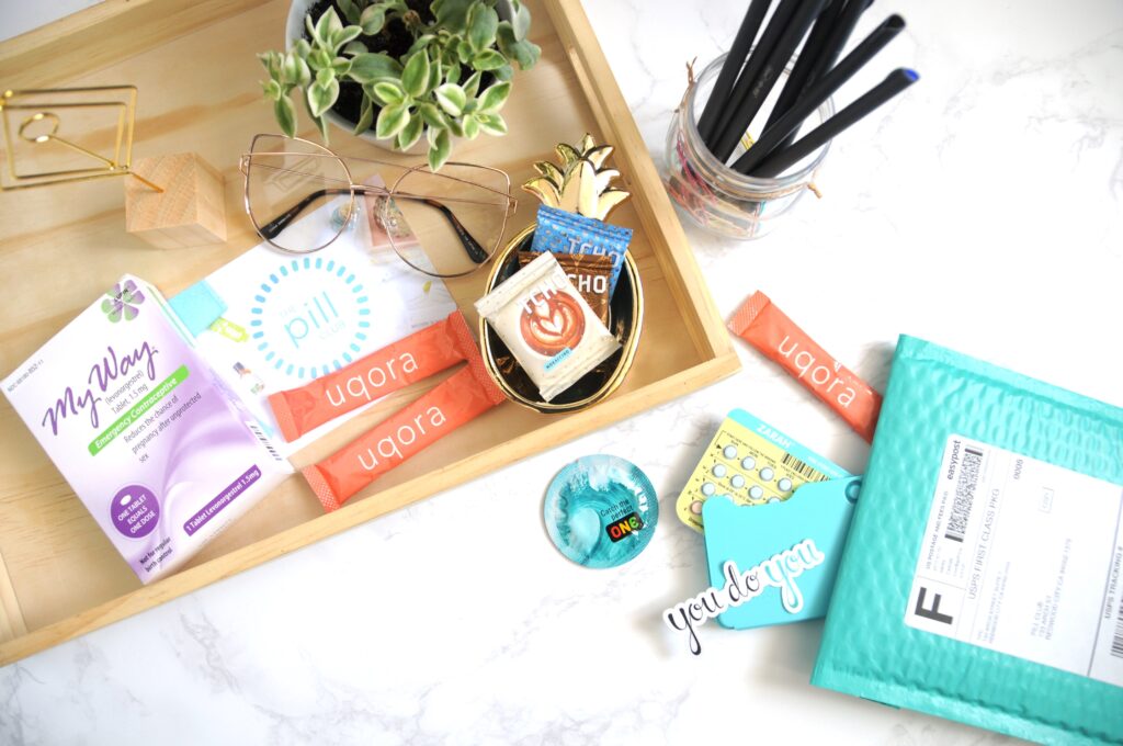
The Pill Club is a birth control subscription box service providing female healthcare services while embracing a social media presence as activists in the community.
Challenge: The current site functions as a portal to update profile information. Due to the lack of utilization, the site is challenging to navigate when changes are required.
Role: Product Designer
Research
I started my research in telemedicine and the growth potential based on The Motley Fool proceeding to the brand’s social presence and user’s interactions online.
The most common concerns gathered included:
- Shipping
- Time
- Payment
- Chat
The Pill Club functions can be simplified into Prescribe / Transfer Birth Control >> Fulfill Prescription >> Deliver Package.
User Persona
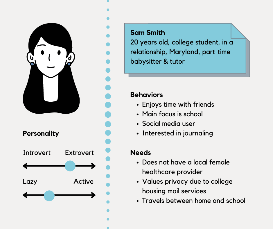
The following user persona was created to communicate The Pill Club’s general client based on this study.
Task Flow
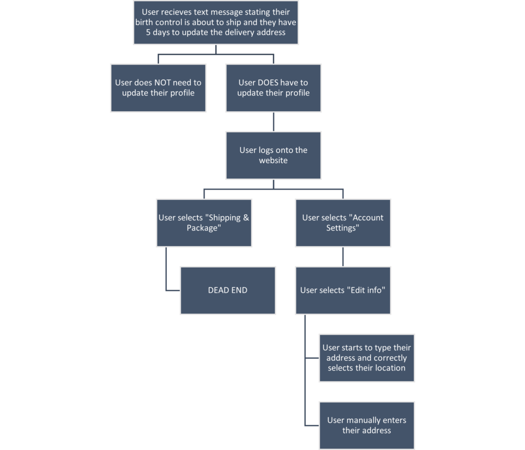
The following task flow addresses an issue experienced by current users and our user persona: An error with shipping due to updating the delivery address.
Current Design
The following image is the current design of The Pill Club’s user profile page.
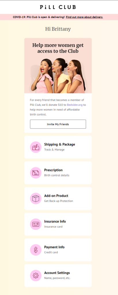
Notable comments:
- There isn’t a banner warning the user to update their delivery address due to their package is pending shipment.
- Under “Shipping & Package” it says “Track & Manage.”
- “Account Settings” is located at the bottom of the page, and the user would have to scroll to view the content.
- Why is the accent color on the top of the page peach, but the icons pink?
- Why is the icon for “Add-on Product” black and the rest are a maroon color?
- There are inconsistencies with capitalization.
The following image is the current design of the “Shipping & Package” page.

Pre-shipment, the only user interaction is the information icon to provide the user with a FAQ on shipping.
The user CANNOT manage their delivery information from this page.
The page does not provide the current location of where the package is intended to be delivered.
Prototype
I had a clear idea based on past experiences with online shopping and reservation dashboards of what I thought should be included on the site.
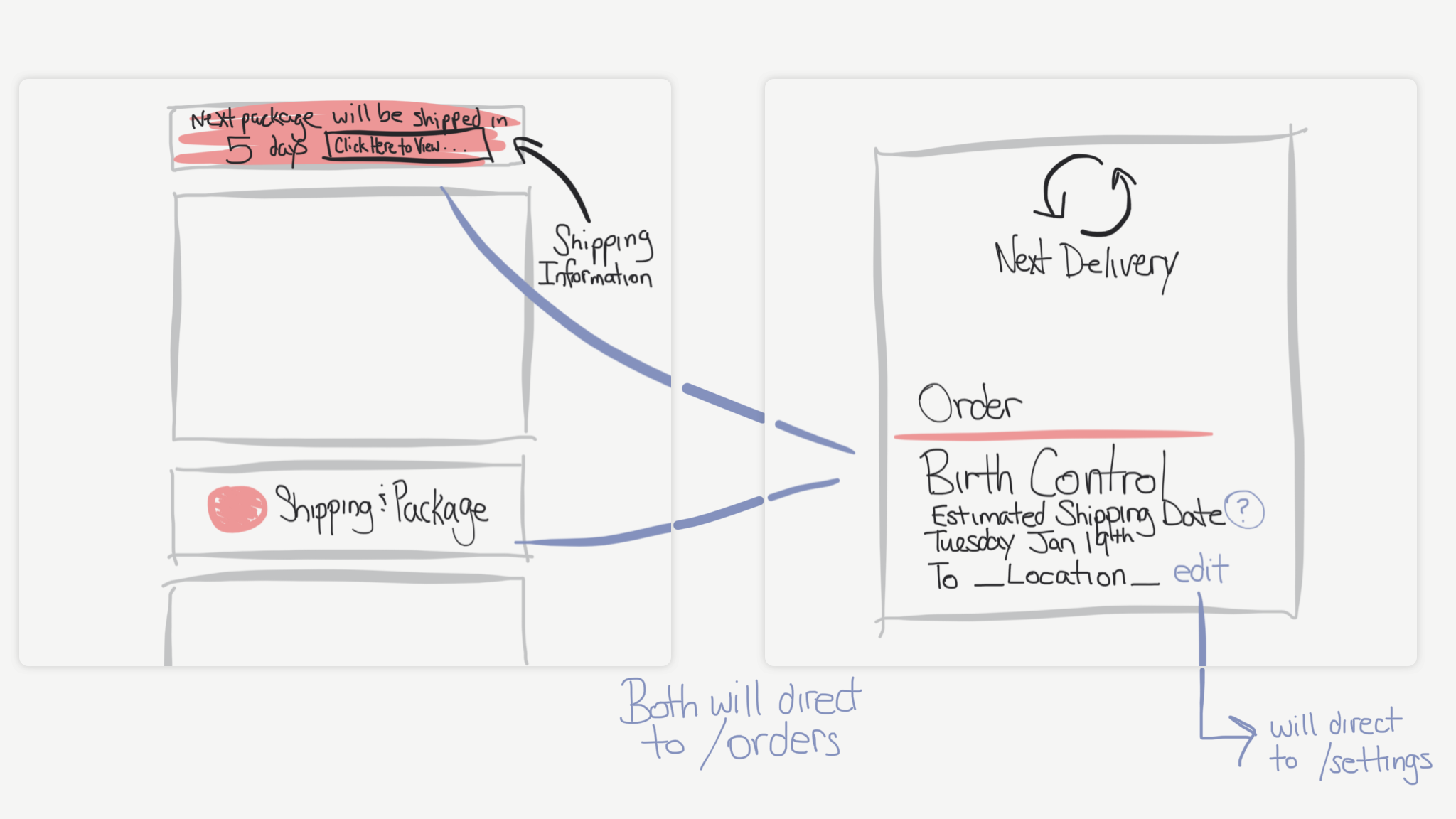
I first wanted to personalize the experience with a banner clearly stating a refill order is about to be shipped with a direct link to confirm the information. I theorized the user is mostly logging onto their profile because they received the text message and therefore should not search for their desired location. It should be right in their face.
Secondly, I wanted to have an explicit confirmation on the orders page where the shipment is being sent. As mentioned earlier, the “Shipping & Package” button says “Track & Manage,” by adding an edit button, the user can manage their order.
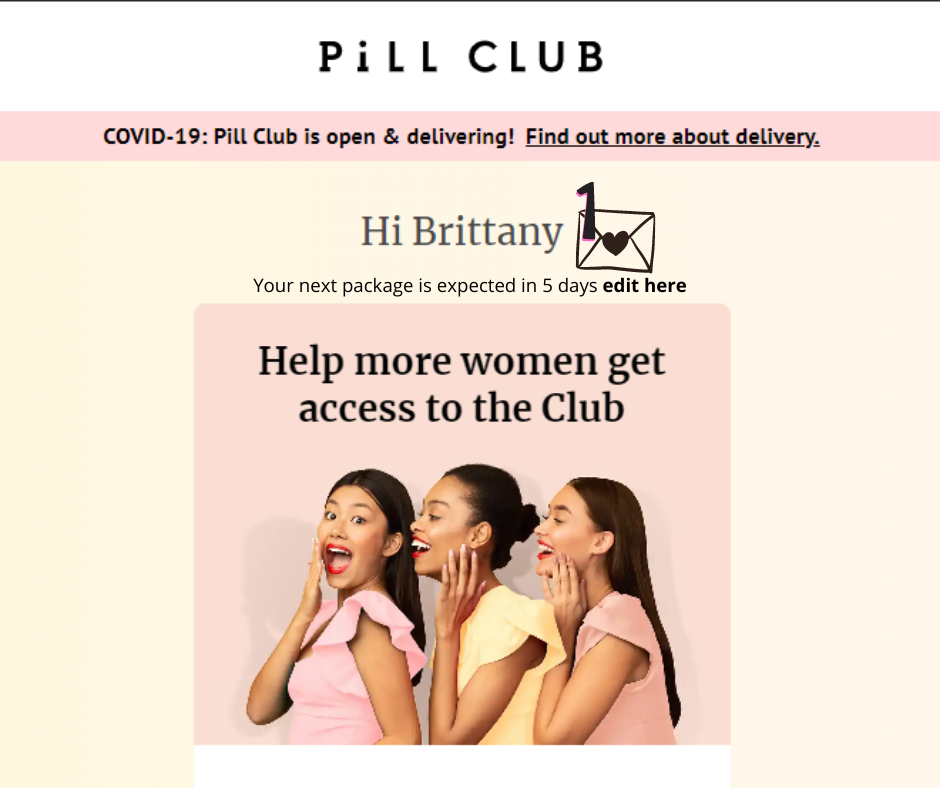
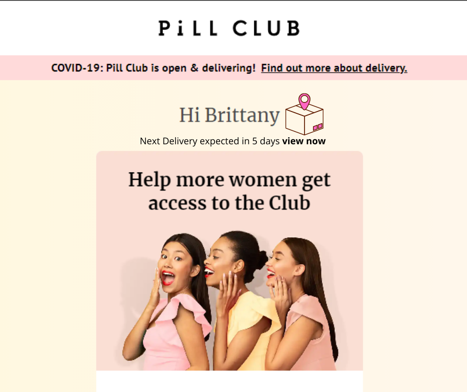
From here, I wanted to play around with some different graphics and texts to relay the information without a banner because I decided to display the information more like a pop-up message when hovering over the animated graphic, and I gathered user feedback to determine which design combination was best.
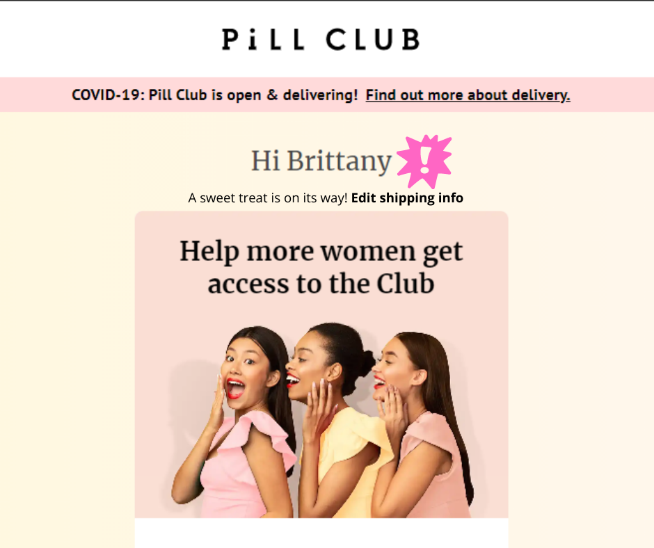
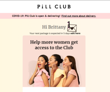
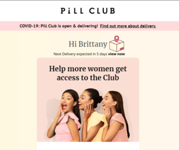
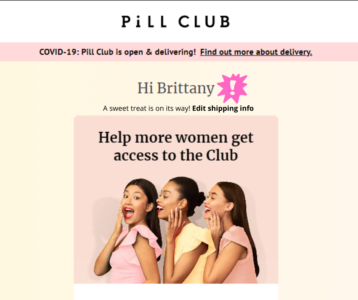
I also redesigned the “Shipping & Package” page to notify the user where the package is being sent and added an option to edit the information. I had two approaches for this design: fill in the empty space and stay consistent with the current layout.
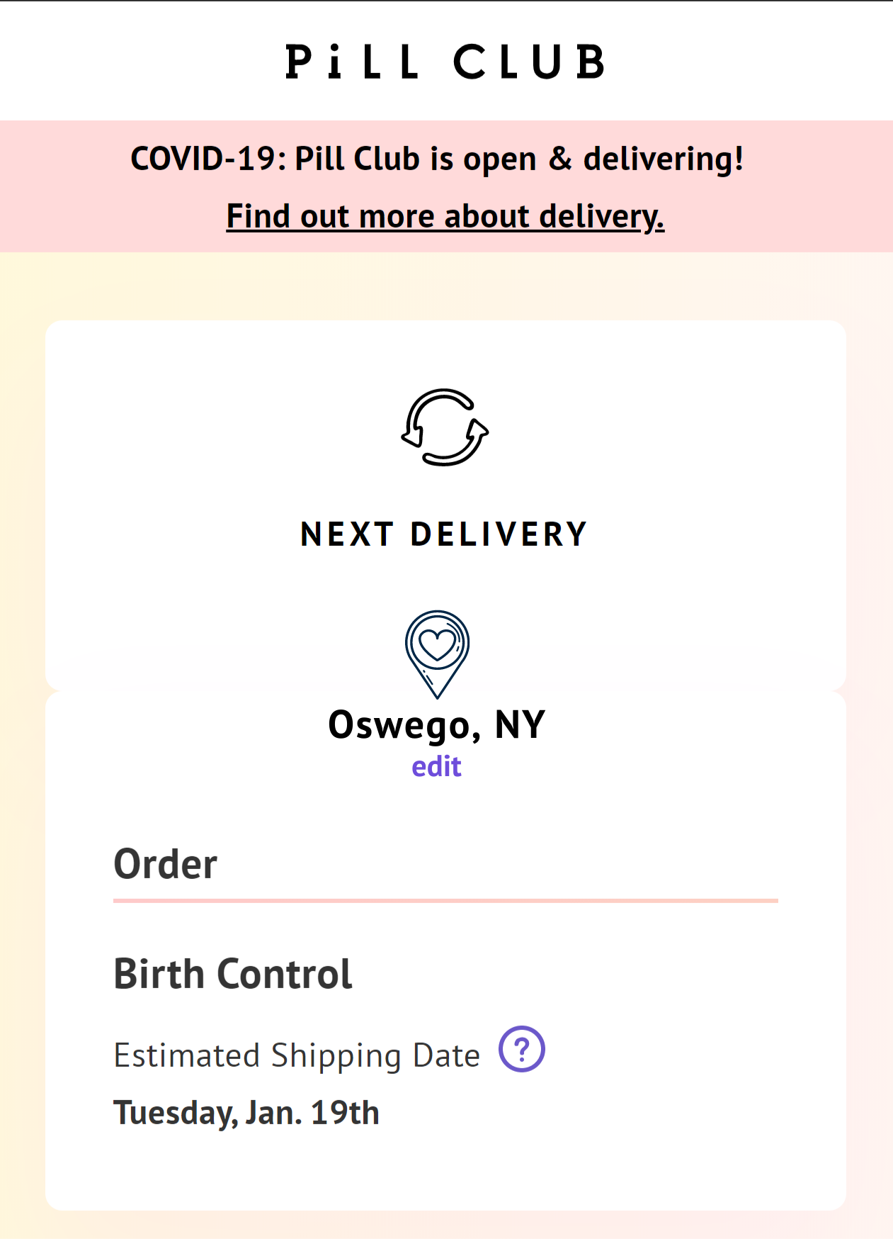
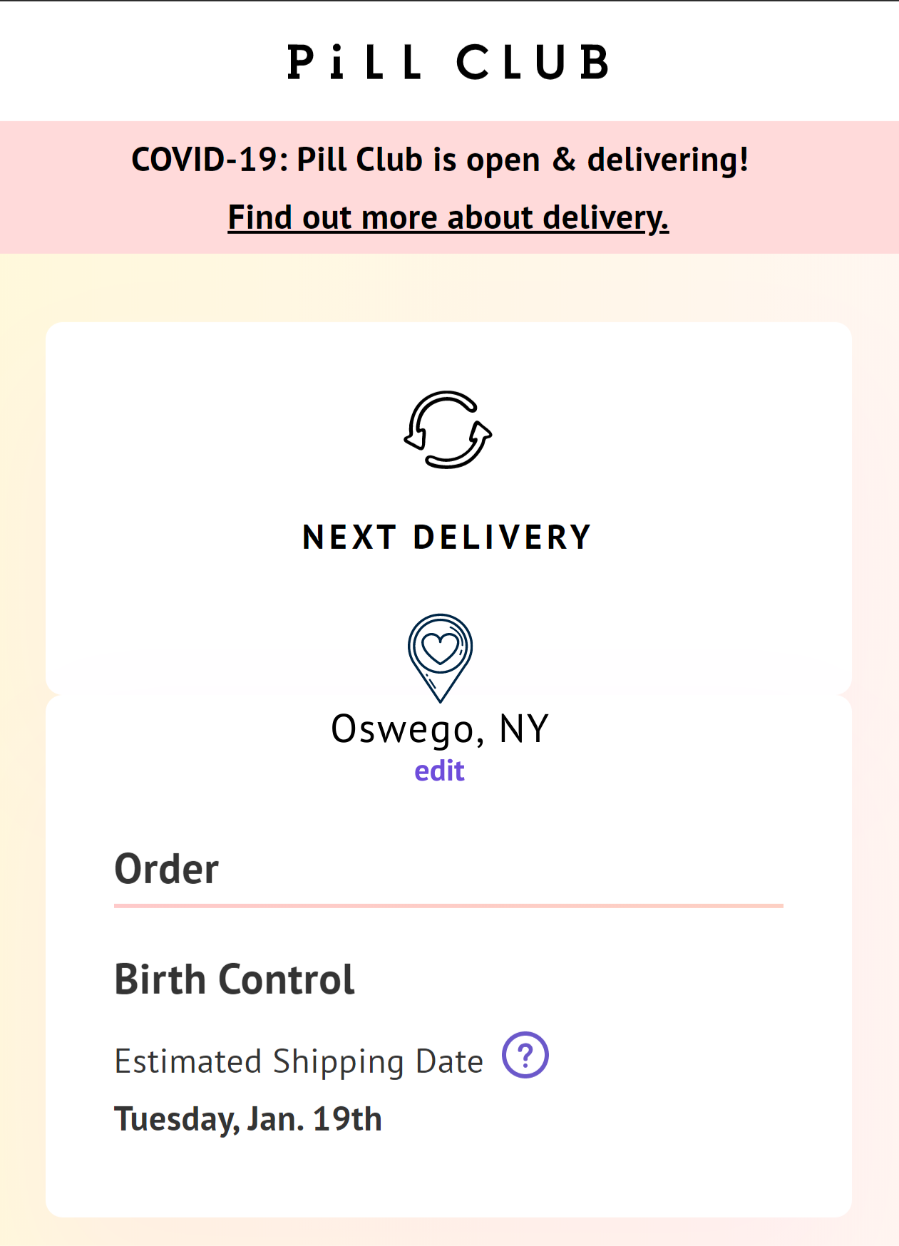
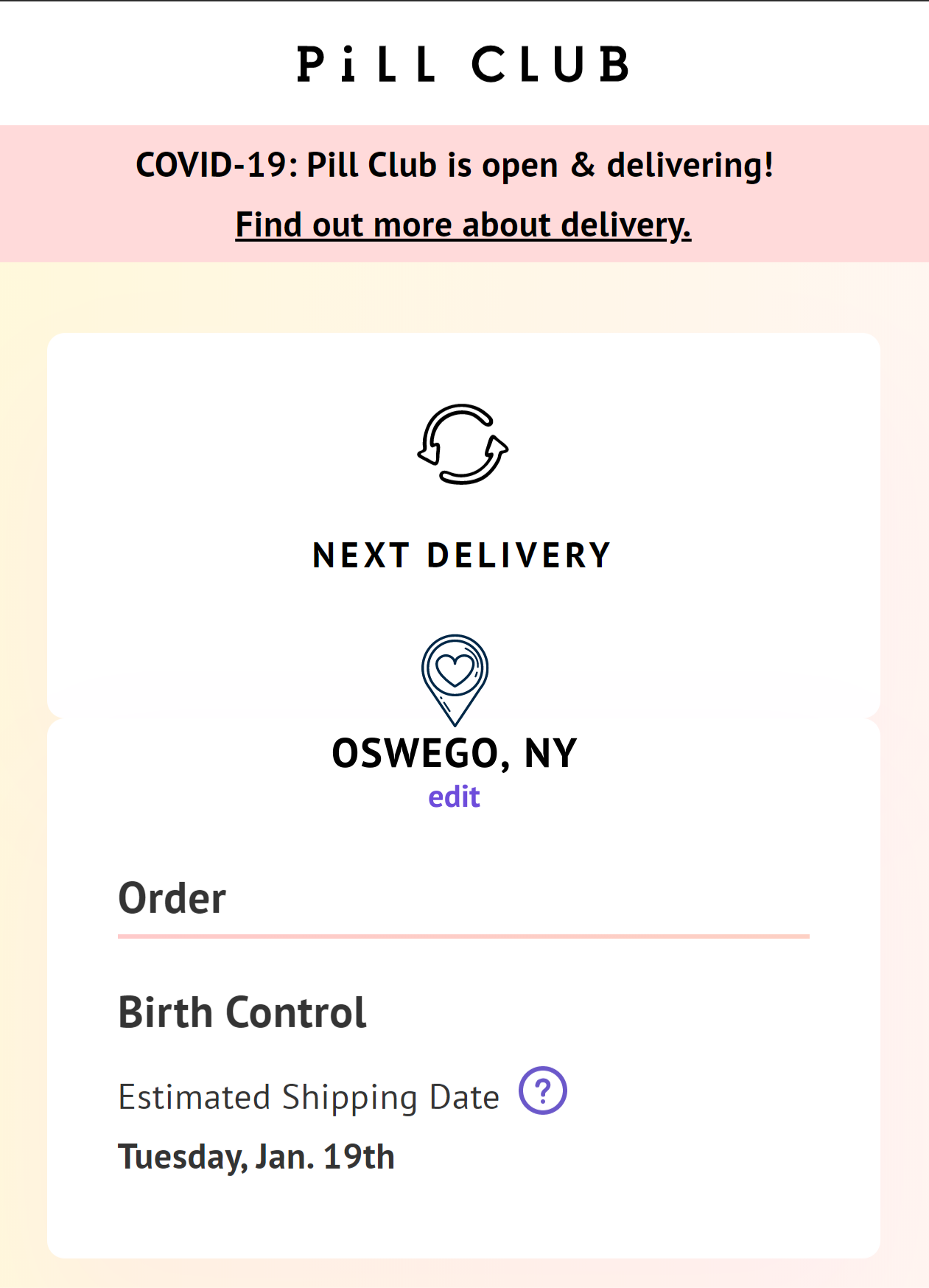
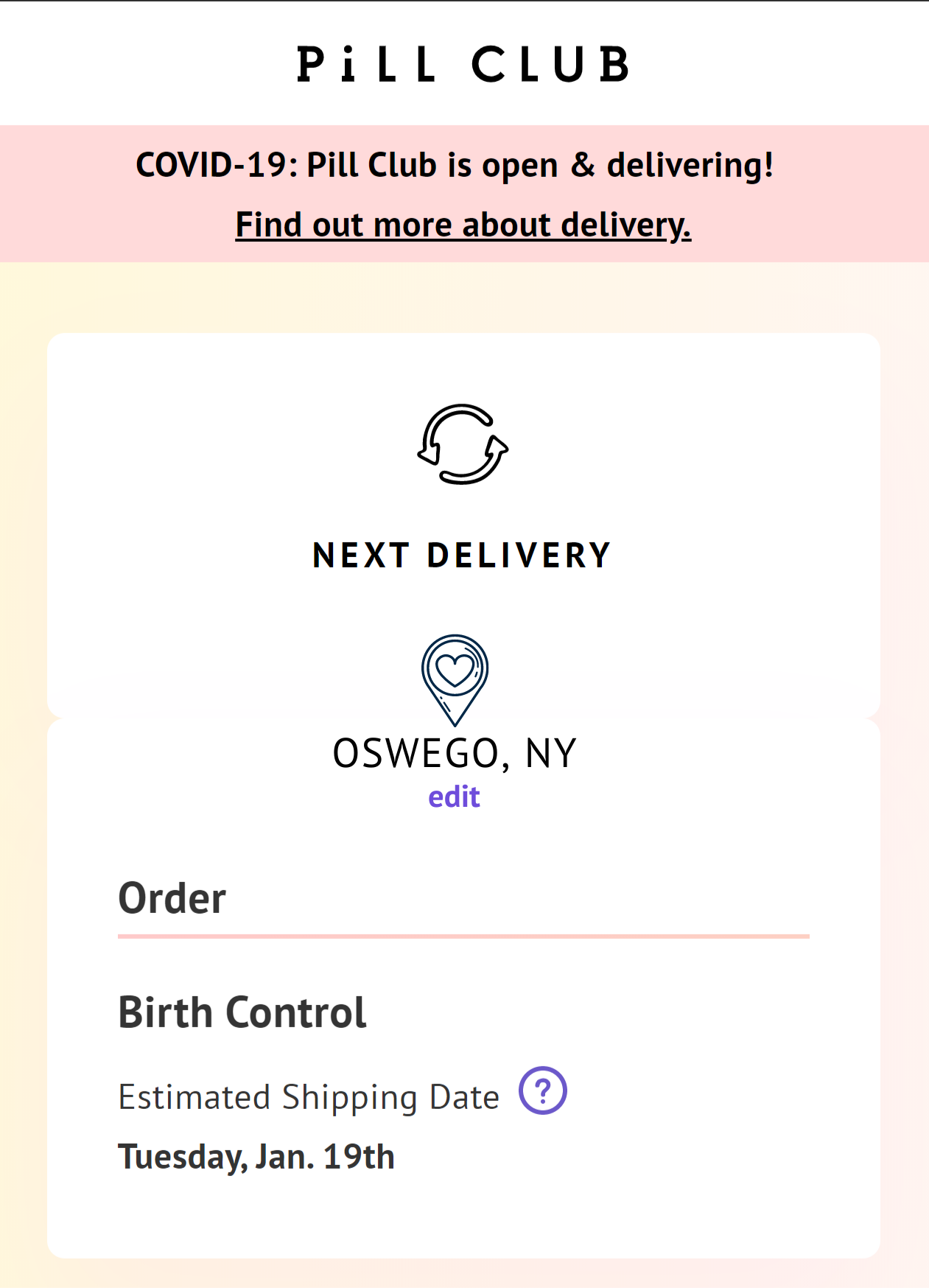
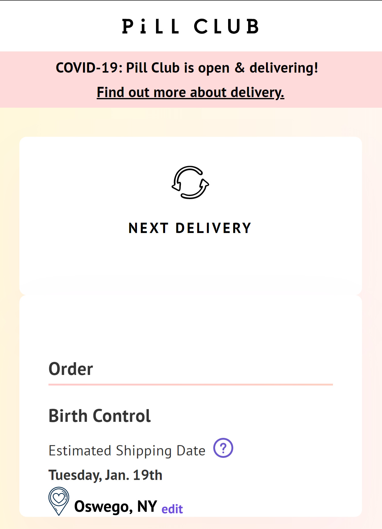
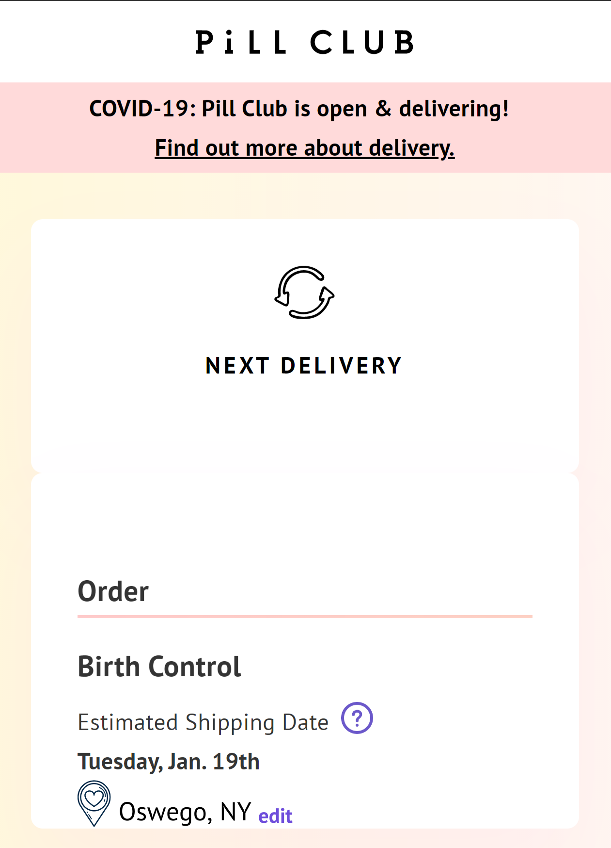
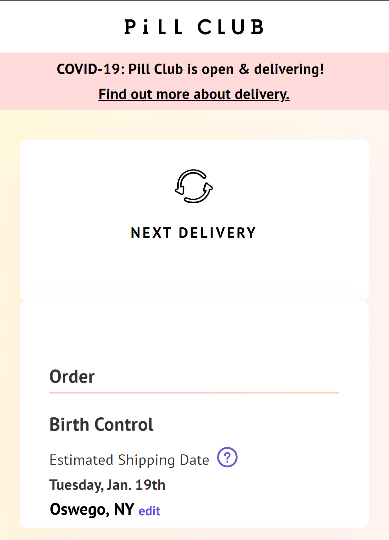
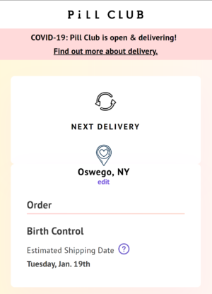
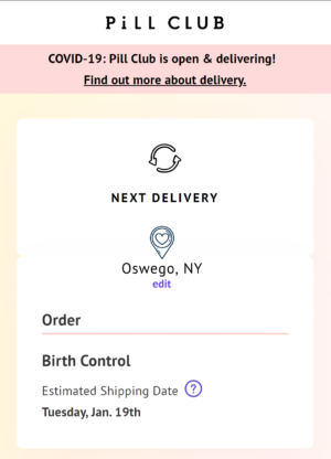
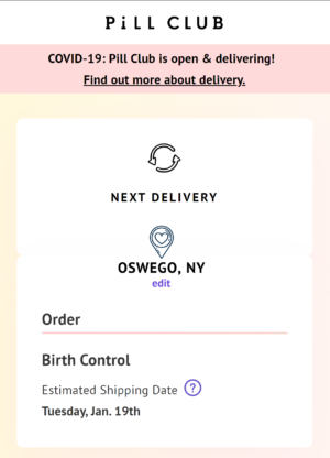
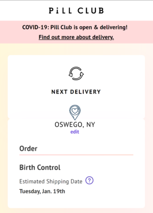
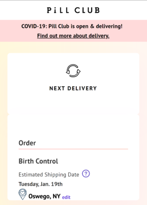
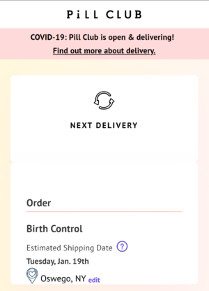
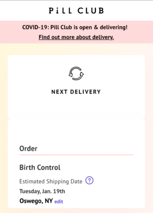
Note: These are not final design decisions, only concept art
Results
The participants of the study were encouraged to mix and match their preferences. The following results reflect the majority of 16 young adult ladies.
Banner-like Notification
- Art Style Preference – Image 1
- Graphic – Image 2
- Message – Image 1
- Call to Action – tied Image 1 & Image 2
How to implement >> The shipping box should be the same graphic associated with “Add-on Product” and use the same location pin used in the following test. I envisioned the graphic being animated to entice the user to hover their mouse over it to reveal a pop-up bubble with the message.
Shipping Page
- Location – Fill in empty space
- Bold – No
- Capitalization – Normal
- Overall – Image 2
How to implement >> The font should be smaller to be the same size as “Estimated Shipping Date” and the icon recolored to be black.
Conclusion
The Pill Club’s site’s current design does face a usability issue due to misleading wording and distance from the user’s mouse starting location and the desired position.
The suggested redesign validates user’s assumptions of managing their shipping information and confirms to the user where their package will be shipped (not just the expected shipping date). Lastly, the added notification provides a direct message and link to update their address from the profile’s dashboard.
As a Pill Club user, this is an issue I have personally encountered which sparked my interest in this case study. I was impressed by the text message warning me to update my address. However, I ran into the issue of clicking the wrong button when attempting to make the change. The brand’s mission included providing accessible female healthcare and should extend to accessible usability.
Note: I do not work for nor affiliated with The Pill Club. This UX Case Study was developed as a personal project and learning experience.
